The game allows the player to prepare an area for different natural disasters. This is done by giving the player a limited budget that they can use to upgrade infrastructure, early warning detection systems, educating the population about safety protocols, etc. Then the player has a limited amount of time before natural disasters such as tsunamis, wildfires, hurricanes, earthquakes, and floods ultimately reach the area in which the player is trying to save. The objective is to save as many lives and lose as little town infrastructure as possible.
This first image is of a town that was constructed on the coast and a tsunami was eventually going to make landfall.

This game requires the player to build two hotels, a school, and a hospital in safe areas. I chose to place them on highly elevated ground and the farthest I could from the shore to protect them from the waves. The first items I chose to protect the area was an early detection device and other upgrades to the buildings that increased the tsunami disaster education of the people, evacuation signs, other alarms, and reinforced almost all of the building's outside structures. I then used many forms of defense such as different types of trees, sand dunes, and barriers in the the water to help break the waves.

This image shows the result of the tsunami. The precautions I took turned out to be a success. Although 17 people lost their lives, hundreds were saved thanks to the early detection systems, education of the public, and defense barriers in place. I believe educating the public and having adequate evacuation plans is the most important element to saving lives in the event of a tsunami. Defense barriers are also helpful but the devastating power from a tsunami can often overrun barriers no matter how many you put in place. One thing I could have done better was reinforce all of the buildings in the path of the wave. I ran out of money to upgrade some of the less fortified homes which would have saved a few more lives. Overall, the result was a success.
Then I decided to show what happens when the proper precautions are not taken when preparing for a tsunami. The results turned a little different.

I positioned my school, hospital, and hotels on the beach to start. Although it may be a little unconventional to have a school and hospital placed directly on the beach, hotels are often placed right on the edge of beaches and are extremely vulnerable to tsunamis. I also demolished the fortified houses with bamboo houses and placed them along the water as well. Certain locations in LDC's throughout the world have communities where people live along the coast and the houses they live in are not up to the building standards we have in the U.S. for example. Lastly, I put in no early detection systems or defenses for the people here. Under these circumstances, people have idea that a tsunami will be making landfall unless they realize it themselves and at that point it can be too late. Lets see what happened...

As you may have guessed the community was devastated with high death counts and injured people and an extremely large economic loss occurred. This exercise may have drastically simplified the process of tsunami protection, but it shows how communities that do not prepare for environmental hazards can be much more vulnerable to something like my second scenario.
__________________________________________________________

This is a map of the historical records of tornadoes in the U.S. since the 1950s. Tornadoes can show us a good example of the behvioral paradigm of environmental hazards. As you can see from the map, tornadoes generally occur in a specific area in the United States. Although it is a big area, people living between the east coast and the western states generally understand there is a threat of tornadoes happening in the area where they live. Despite the threat, people still continue to live in these areas and accept their frequency. In order to take a complexity based approach to tornadoes, the map would also need to show data on climate change as well, for example. The complexity paradigm combines different factors to attempt to mitigate storms in order to have a better long-term approach to protect against them. If climate change information were added, you could see if the storms are happening more frequently or if they have become more severe recently. This would help determine if more strict building standards need to be put into place in certain areas, for example. The data could also show people that limiting pollutants into our atmosphere is important because otherwise more severe storms may be a threat to them in the future.
____________________________________________________________
Now lets look at some earthquake data. This map shows the areas of earthquake risk assessment in the United States.

This map shows an objective based risk perception of the probability of having an earthquake, with over a 10% certainty, over the next 50 years and the urban areas that would be at risk.

This is a map of the damage from the Northridge, CA earthquake of 1989. It displays the relationships between building damage density, building density, and liquification. Clearly, the higher building density shown on the map corresponds directly with the building density in the area and the unsafe building statistics are where the highest building damage density took place. That is what you would expect to see. Liquification is also shown on the map by the green (moderate), yellow (high), and red (very high) colors. Liquification is important because after an earthquake, the soil can become water-saturated and soil sediments can be transformed into something that acts more as a liquid. This can compromise the foundations of buildings and cause major damage. On the map you can see the highest levels of liquification happened in some of the areas with the highest building density.
Earthquake damage is based on many factors other than building density and liquification. Here are a few other maps that show the Peak Ground Acceleration (PGA) and the Peak Ground Velocity (PGV) of the area in and around Northridge.
*PGA measures earthquake acceleration on the ground and design earthquake ground motion
*PGV expresses the peak of the first integration of the earthquake acceleration record

This map with PGA shading shows how the highest amounts of ground acceleration occurred all around the city of Northridge. This is another clear indicator of why there were high amounts of building damage in the area.

Map of the PGV of the area in and around Northridge. Here we can see by the map's shading that the first integration of earthquake acceleration was much higher where the city was located than many of the other areas surrounding it. It appears the people of Northridge we extremely unlucky and we subjected to the swiss cheese model when dealing with environmental hazards. Many things went wrong together which resulted in the devastation that this earthquake caused on the community.
___________________________________________________________

Map shows the world's active volcanoes, plate tectonics, and specifically, the top five countries in the world according to volcano frequency.
2D Landscape of Mt. Rainer Landscape

Map of a 2D landscape of Mt. Rainer in Washington, U.S.A. This image can be used in a GIS program as a base to add in data layers and create orginal maps.
3D Image of Mt. Rainer Landscape

A DEM (Digital Elevation Model) shows the different general elevations of an area but a TIN (Triangular Irregular Network) is more accurate. It can show the different types of slopes, or edges, associated with the differences in elevation and you can clearly see how they relate to the environment such as rivers that flow from the mountain.
3D Image of Mt. Rainer Landscape Including with Landcover and Lahar Information

The image above shows the direction of Lahar flow after a Mt. Rainer eruption due to things such as the slope of the land and the different types of soil that would be impacted by the lahar and how it would affect it. Also, water can significantly impact the lahars and I suspect things such as dense woodlands compared to open woodlands would as well, among other things.
Mt. St. Helens Eruption Information

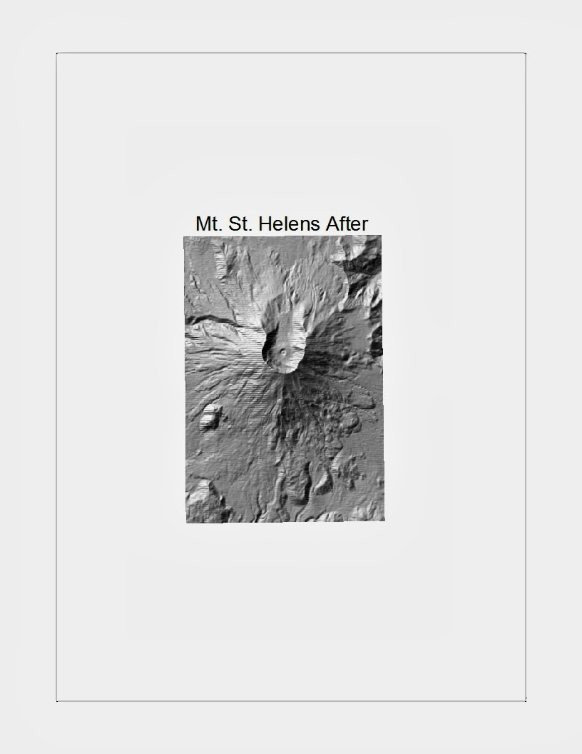
These two maps show the before and after images of Mt. St. Helens eruption in May of 1980. You can observe the large crater on one side of the mountain after the eruption. This was due to a large build up of gas and pressure that caused a bulge on the north side of the mountain.

This map shows the displacement of land that cause a total area volume loss, mainly on the north side of the mountain, after the 1980 eruption. This would turn out to be the deadliest and most destructive volcanic eruption in the history of the United States.
______________________________________________________

This map shows areas in the continental United States that are at a high risk for mass movement hazards such as landslides, rock falls, etc. and possible explanations for those events.

This map shows the different shaded area that correspond to slopes of 30, 60, and 90 degrees respectively. The steepness of the ridges shown are important when determining the vulnerability of mass wastage. The darkest shaded areas have the flattest slopes and therefore are the safest in regard to potential slope failure.

This map shows the affected area of Forest Falls after the deadly mudflow in 1999. It shows how elevation, slope, streams, and slopes aided the mudflow's course of destruction. The flow accumulation corresponds with
the parcel damage completely. The highest levels of damage follow the flow
accumulation. The existing stream starts off at the same point but then diverts
east of the flow accumulation and does not appear to have caused as much
damage. The existing stream may have been diverted by the town in order to
build homes and businesses in the areas where the stream used to run through.
That is why the mudslide followed the existing path.
______________________________________________________________________

Map showing a 100 year flood of the Chippewa River in Eau Claire and its subsequent impact on the University of Wisconsin--Eau Claire campus and the surrounding community. Many university buildings are flooded and the residential housing zones along the river have been greatly affected.

This map is upgraded to a 790 foot flood of the Chippewas River. Major differences from the previous map can be seen as the flooding for the 790ft flood impacts a much larger area of the city and affects many more people. These maps can be used as mitigation strategies for the area. Anyone that wants to build on a zone that is at risk for floods such as this could be turned away or might have to pay high insurance rates in order to build there. A municipality could create public zones here so private homes and businesses cannot be built in these areas.

Map showing yet another image of the Chippewa River flooding. This map is upgraded to an 800 foot flood and appears to fill the entire flood basin of the area in and around the university's campus.
3D Structural Imaging From 100 Year Flood Of The Chippewa River

This is 3D imaging of the Chippewa River and UWEC after it is impacted by a 100 year flood. You can clearly see the buildings that are raised up in the image that give the viewer a better idea of which buildings would be the most impacted by a hazard event such as this.
__________________________________________________________________

Map of Ventura tsunami in 1812. There is a large tsunami inundation area that impacted a region that lies at or below sea level in many areas. The facilities (medical, emergency, schools) at risk are highlighted as well.

This map shows the storm surge of a hurricane that projects as Category 3 storm on the Saffir Simpson Scale. The population density is also shown in the map and clearly would be directly impacted by a storm this size. Seculating, this could be due to developers removing land in order to build up the infrastructure of the area and lowering the overall land elevation.
No comments:
Post a Comment